

Jeralume Furniture
Reimagining stress-free furniture shopping for young families
ROLE
UX/UI Design
12 weeks (2025)
Academic Redesign Project
- Information Architecture
- Visual Design
- Financial Integration
SKILLS
Adobe XD, Illustrator, Photoshop
Product Overview
Jeralume Furniture is an online furniture retailer offering diverse products and flexible installment payment options. The brand’s core value is enabling customers to purchase furniture “stress-free” through partnerships with multiple financial institutions. However, the existing website suffers from confusing navigation, unclear information architecture, and underemphasized key selling points, resulting in high bounce rates, low conversion rates, and an inability to effectively communicate brand value.
Goal
Highlight Core Brand Value
Elevate “stress-free installments” from secondary information to a core selling point, making financing options the user’s first impression through visual design and information architecture.
Optimize User Experience
Restructure navigation and information architecture to enable users to complete shopping tasks in minimal time, reducing decision fatigue.
Build Purchase Confidence
Complete product information and user review systems to lower the psychological barrier of buying large furniture online.
Pain Points
The original website’s product categorization logic is unclear, with no distinct separation between primary and secondary navigation. Users must click multiple times and navigate back and forth to find desired product categories. This confusing navigation structure creates significant frustration for users.
Lack of User-Centered Design
The website design prioritizes “what the company wants to show” rather than “what users need to see.
Unplanned Information Architecture
Content organization lacks logic and fails to consider users’ mental models and usage contexts.
Unclear Core Value Proposition
No strategic emphasis on the brand’s key differentiator (financing options), allowing it to get buried among other information.
Absence of Trust-Building Mechanisms
Buying large furniture online requires trust-building elements (reviews, detailed information, preview features), which the existing website fails to provide.
Problems
High Bounce Rate
Users quickly leave due to inability to find desired products or confusion
Low Conversion Rate
Even when users find products, they abandon purchases due to insufficient information or unawareness of financing options
Loss of Competitive Edge
Core advantages go uncommunicated, driving users to competitors like IKEA and Target
Blurred Brand Perception
Unable to establish clear brand positioning and memorable identity in users’ minds
Increased Customer Acquisition Cost
Requires higher marketing budgets to compensate for inadequate website experience.
Opportunity Points
Restructure Navigation
Enable users to find any product within 3 clicks.
Complete Product Information
Provide all information needed for purchase decisions
Highlight Financing Options
Transform core advantage into brand identity
Emotional Banner
Build connection between brand and users
Competitive Analysis
To understand best practices and design trends in the North American furniture e-commerce market, I analyzed two major competitors. These competitors share similarities with Jeralume Furniture in target audience, business model, or key features, providing valuable insights for the redesign.
- Significant presence in the North American market
- Online furniture shopping services
- Target audience overlaps with Jeralume Furniture (25-35 year-old families)
- Financing options or distinctive shopping experiences
Navigation Clarity
Clear multi-level categorization
Simple and effective, not overly complex
Confusing structure, unclear categorization
Product Information Completeness
Detailed specifications
Clear information
Insufficient information
Financing Options
Functionality-focused, somewhat cluttered
Monthly payment displayed but not prominent
Barely visible, not emphasized
AR Functionality
Yes
No
No
Visual Design
Functionality-focused, somewhat cluttered
Refined and high-end with ample white space
It's barely noticeable when it's not emphasized.
Brand Warmth
Lacks emotional connection, feels like a big-box store
Strong lifestyle positioning
Outdated and cluttered, lacks character
User Review System
Comprehensive
Available but limited quantity
No
Product Selection
Vast selection
Curated selection, uniform style
Diverse selection
Price Positioning
Mid-low to mid-high, wide range
Mid-to-high-end, relatively expensive
Affordable pricing + installment options
Design opportunities identified through competitive analysis
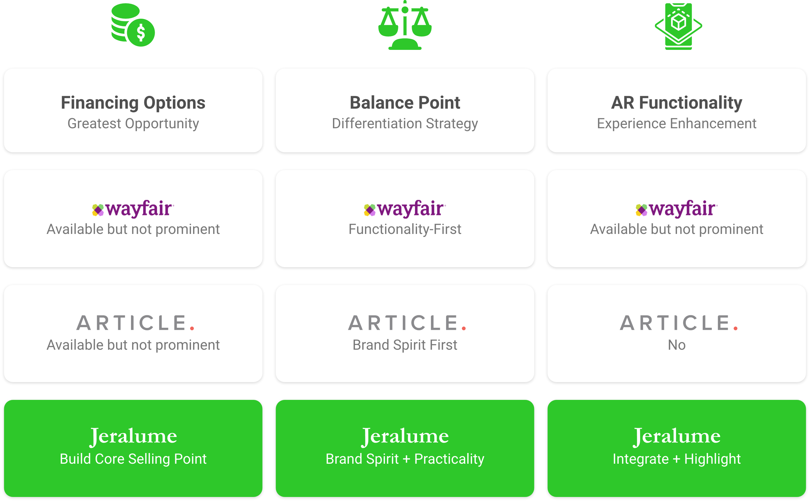
Jeralume’s Strategic Direction: Leverage strengths, avoid weaknesses: Wayfair’s functionality + Article’s aesthetics + prominent financing = Jeralume’s differentiated positioning Specifically:
- Navigation as clear and effective as Wayfair
- Visual design as warm and refined as Article
- Most importantly: Make “installment payments” the core brand identifier
- This is what both competitors fail to do well—and Jeralume’s greatest opportunity.
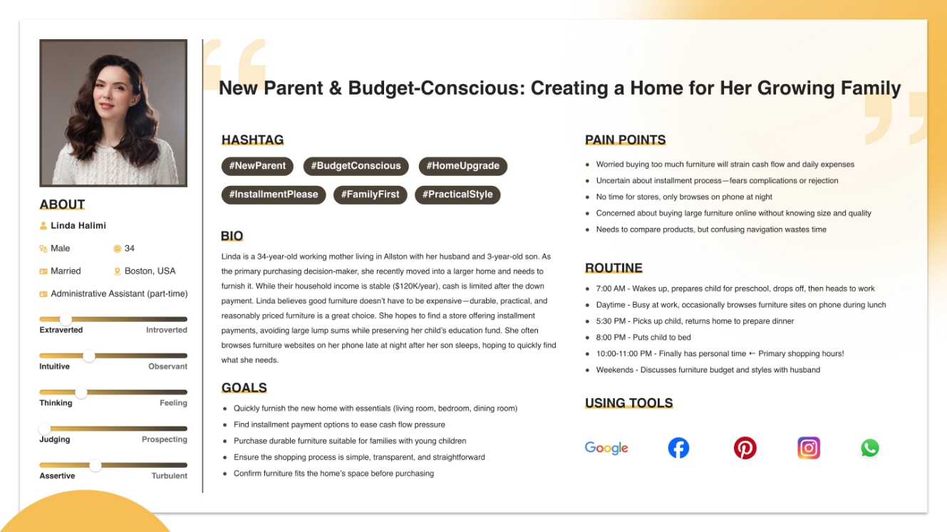
Persona
Jeralume Furniture serves diverse customer segments, but this project focuses on the primary audience “most in need of installment payments”: Primary Segment (60%): New parents & newlyweds Secondary Segment (30%): First-time homebuyers/renters
Common characteristics:
- Life transition phase requiring substantial furniture purchases
- Stable income but limited savings
- High acceptance of installment payments
- Tech-savvy, willing to use tools like AR
Why focus on them?
- Greatest need for financing options (core differentiation)
- Become long-term customers (high Lifetime Value)
- Generate social recommendations (word-of-mouth effect)
Design Strategy
Highlight Core Value — “Stress-Free Installments”
Elevate “flexible installment payments” from hidden secondary information to the brand’s core identity, making users immediately associate Jeralume Furniture with “easy installments.”
Greatest Differentiator
Competitive analysis shows Wayfair and Article offer installments but don’t emphasize them. Jeralume has the opportunity to establish itself as the “installment expert.”
Primary User Need
Users aged 25-35 are in life transition phases (marriage, parenthood, relocation), requiring substantial furniture purchases with cash constraints. “Can I pay in installments?” directly impacts purchase decisions.
Build Trust with Specific Numbers
Don’t say: “We offer flexible financing options” (too vague)
💳 0% interest installments: 3/6/12 months
💰 Starting at $500/month
✅ Fast approval, same-day decision
Specific numbers reduce uncertainty, enabling users to immediately assess “Can I afford this?” and build trust.
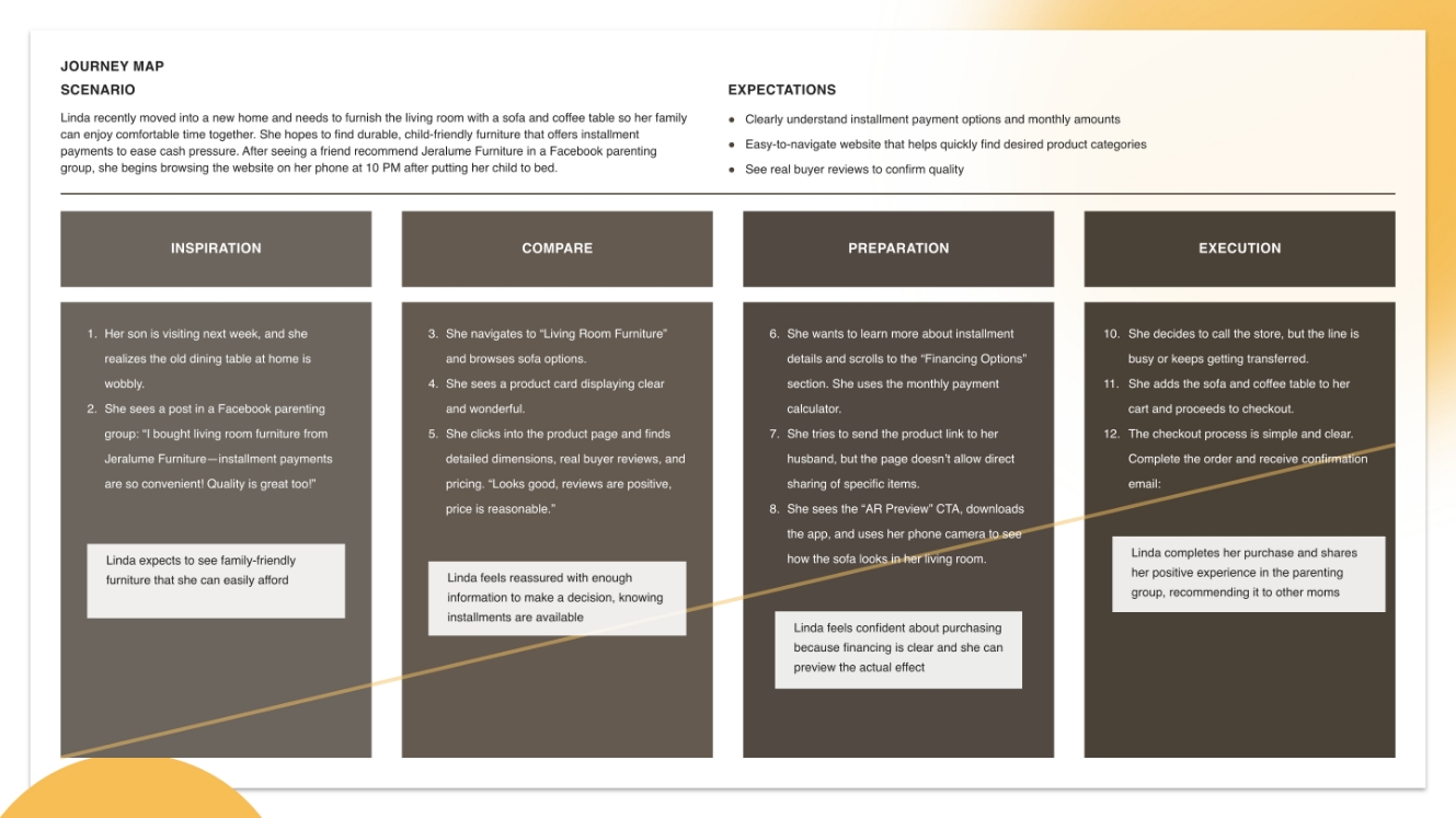
Enable busy Linda to find any product within 3 clicks, reducing search time and frustration.
Impact on Linda: She only has time to browse after 10 PM, lacks patience for extensive searching, and will leave if products aren't easily found.
Adopt Clear Two-Tier Navigation Structure
Primary Navigation:Positioned at visual focal point and Immediately visible
Design Rationale:
- Informs users "how many options inside
- Sets mental expectations
- Reduces choice anxiety
Expected Outcomes:
- Reduced clicks: 5-6 average → 2-3 clicks
- Decreased product search time
- Lower frustration, reduced bounce rate
- Smoother user experience
Enable busy Linda to find any product within 3 clicks, reducing search time and frustration.
Build emotional connections with target users like Linda through storytelling and warm visuals, positioning Jeralume Furniture not as "a furniture-selling website" but as "a partner who understands my needs.
- Furniture is an Emotional Purchase:Unlike buying daily necessities (purely functional) More about "creating ideal living" Users need emotional resonance
- Linda Wants Understanding, Not Sales Pitches:Exhausted from work and childcare daily. Doesn't want hard selling. Seeks understanding of her situation
- Emotional Connection = Brand Loyalty:Memorable brands with warmth Proactive recommendations to friends. Long-term customer relationships
Implementation Methods
Banner 1 - For New Parents:Creating comfortable spaces amid busy lives
Banner 2 - For Newlyweds:Building your first warm memories in your new home
Banner 3 - For First-Time Buyers:Quality living on a budget
Why This Works
- Why This Works
- Creates "this is for me" feeling
- Emotional resonance outperforms discount messaging
Messaging Tone:Warm, understanding, supportive—not sales-driven
- No rush to close sale
- Understand first, suggest second
- Users feel respected
Expected Outcomes:
- Enhanced brand favorability
- Increased browsing time
- Greater social media sharing willingness
- Established long-term brand loyalty
Increased user awareness of financing options
Increased percentage of users choosing installment payments
Reduced abandonment due to “price pressure”
Established “stress-free installments” as brand identity
Design
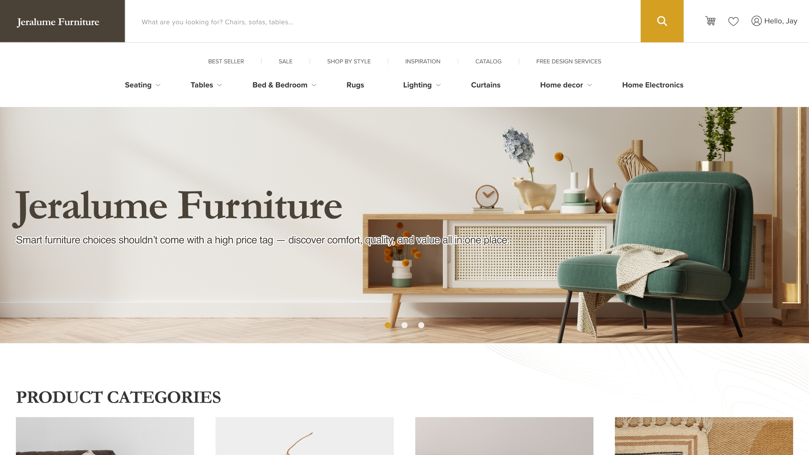
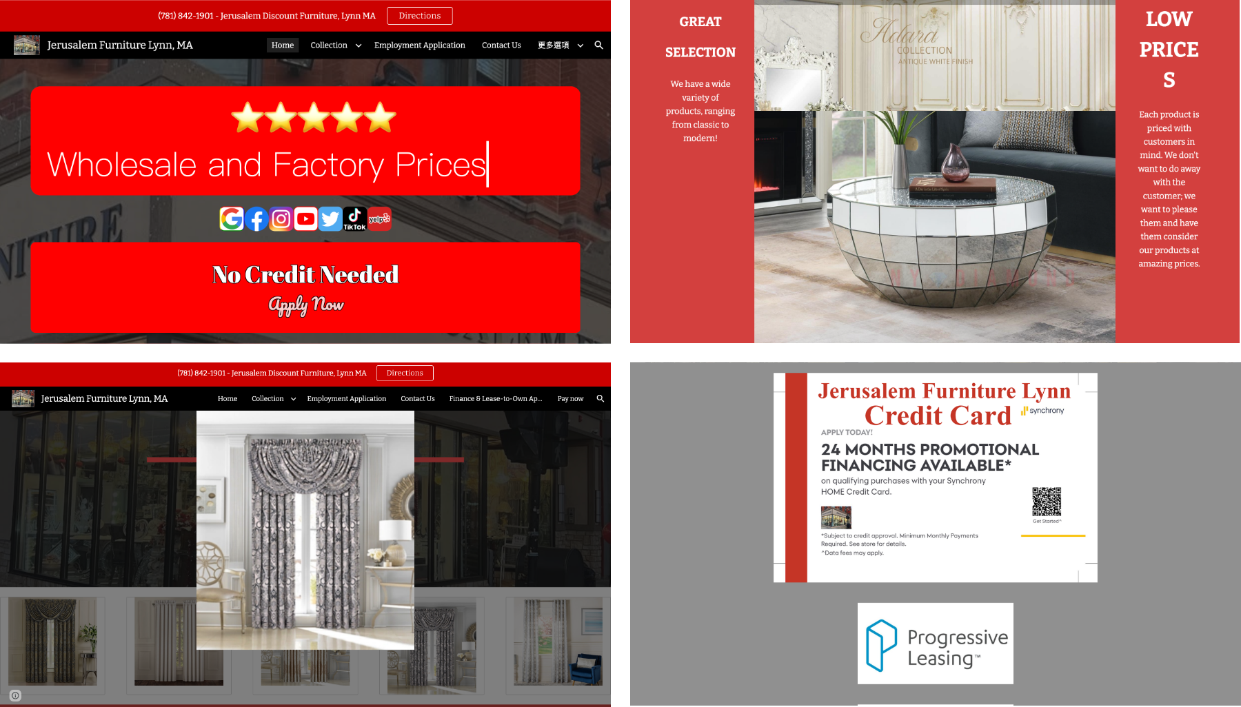
Main Nav: Use smaller and lighter text for the secondary navigation to differentiate it from the primary navigation.
Second Nav: Organize the products into categories so that visitors can quickly find what they’re looking for.
Banner: Use storytelling slogans on the banners. Different banners should feature different slogans to attract various target audiences.
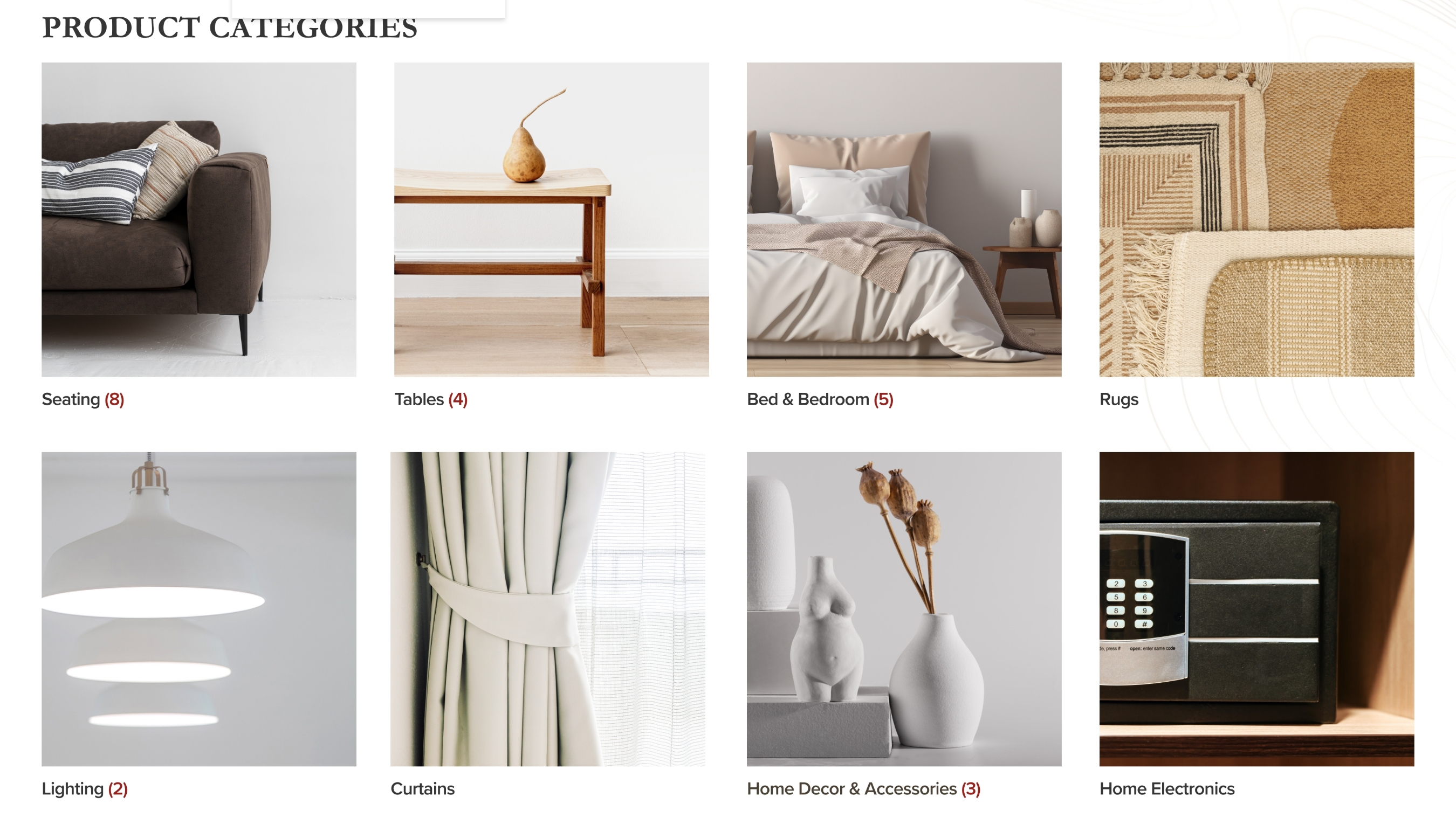
Categories: Both the banner and the overall layout follow an F-shaped reading pattern. This design aligns with how most users read web pages, helping catch their attention quickly. The product categories are high-level groupings. I chose warm and harmonious tones for the photos here to reflect the brand’s spirit. If there are subcategories, a number is shown for clarity.
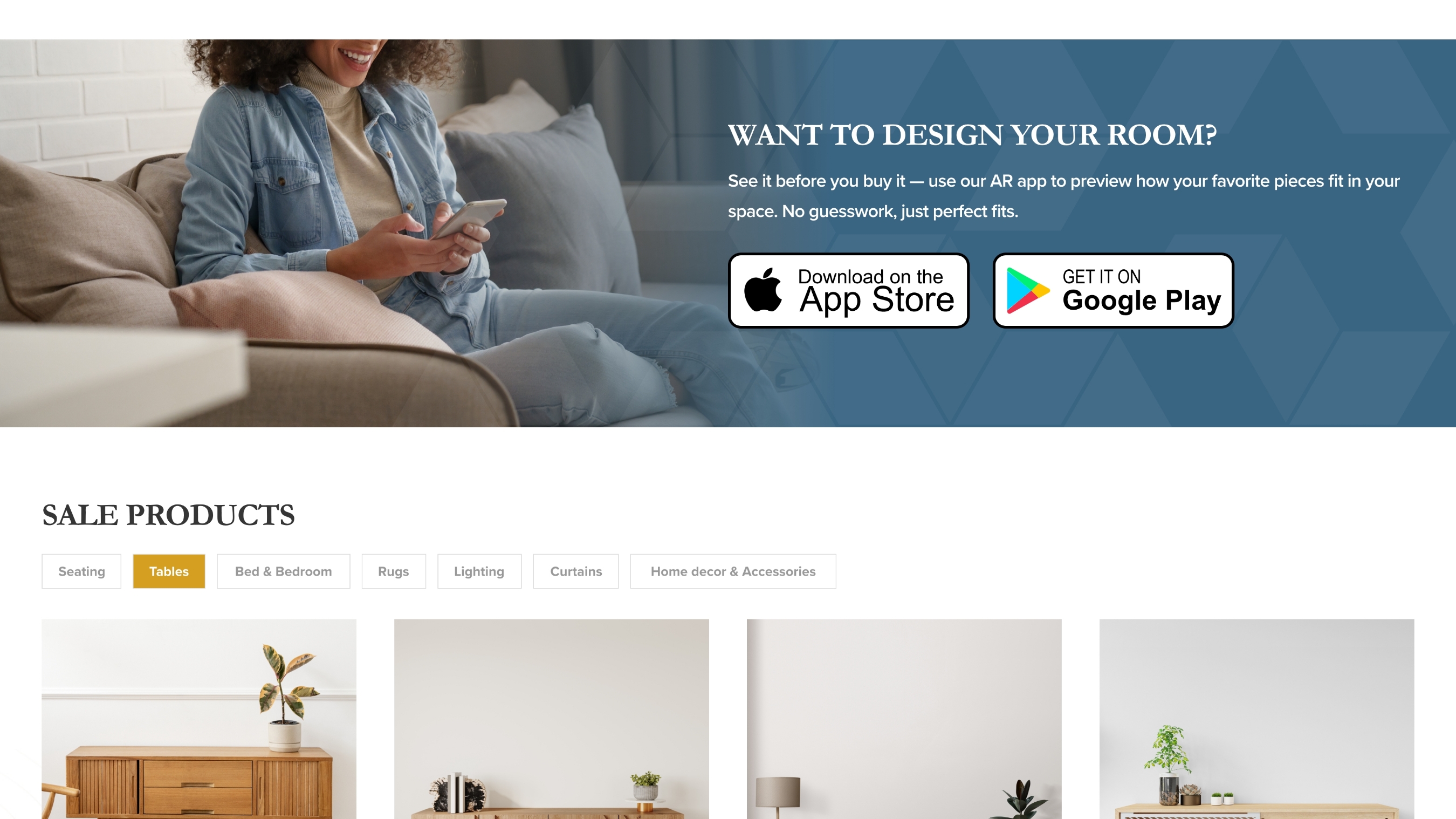
AR: “Want to design your room?” This is a CTA encouraging users to download the app. By doing so, they can use AR to visualize how jeralume Furniture pieces would look in their space. The image is enlarged to highlight where to access this service. Since part of the target audience is middle-aged users, this design aims to catch their attention and lead them to download the app. Clicking on it will take them directly to the store page.
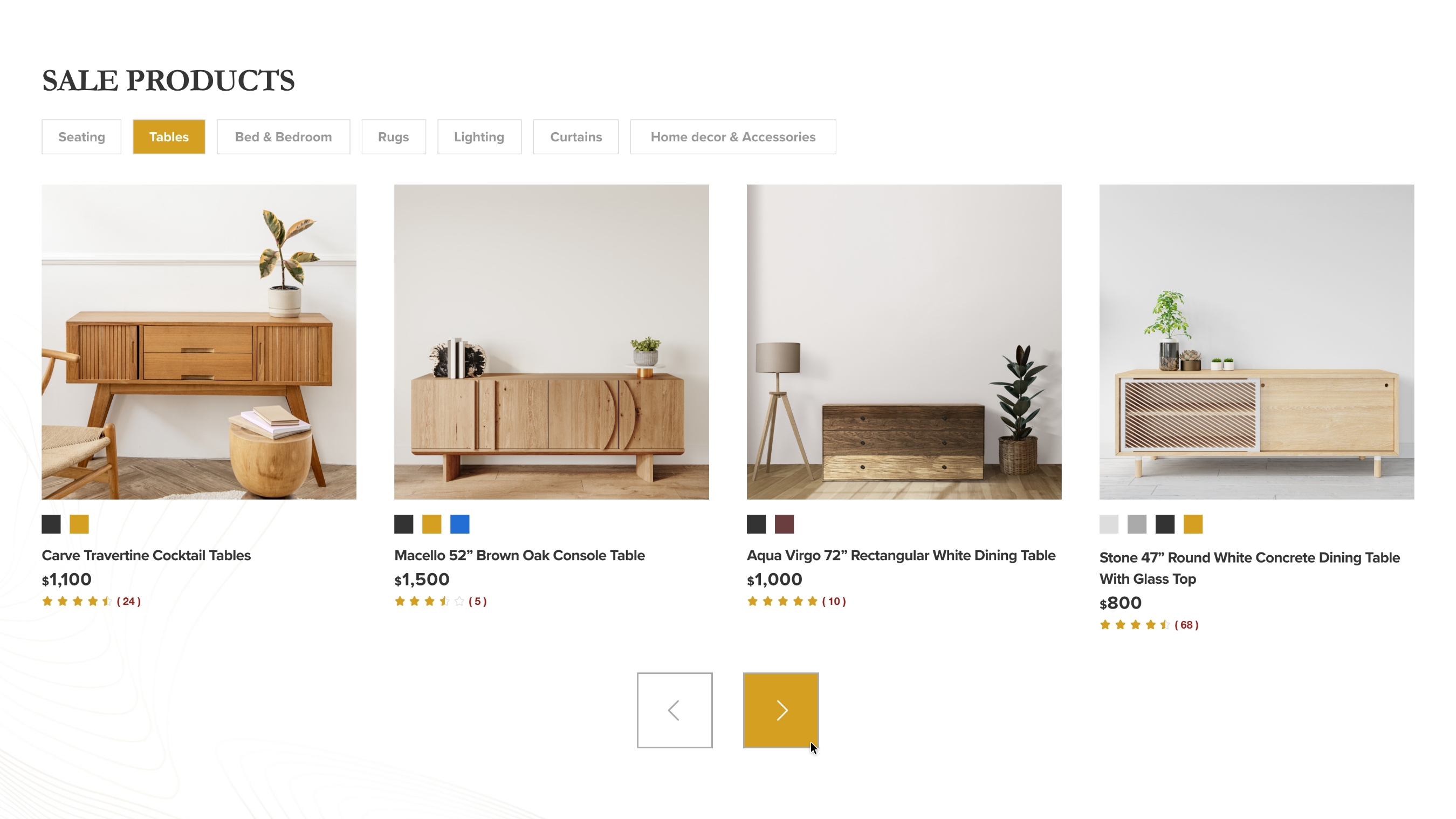
Sale: Allowing users to quickly browse different categories of sale items, making the experience more user-friendly. Product info includes buyer ratings. This feature helps grab attention, especially if the product has good reviews.
Finance: I used relevant images in the finance aid section. The original website emphasizes stress-free furniture shopping, thanks to installment options through their finance aid partner. So I chose images that reinforce this collaboration. As mentioned above, this is an important section. I think it’s necessary to clearly show users the different ways they can apply for finance aid. It helps them realize that buying furniture from jeralume Furniture can be a relaxed experience.
The footer navigation is less important than the header nav, so I placed it at the bottom. I organized it clearly in list form, making it easier for users to find what they need. Subscribe is a CTA for subscribing to jeralume Furniture. I made it visually obvious and added a short description below to encourage users to subscribe.
Filters:Filters can find your preferred products quickly.
Add to Wishlist: Heart icon makes it easy for users to quickly add their favorite products to their wishlist.
Page: A maximum of 12 items are displayed per page to make it easier for visitors to browse and find products. Using infinite scroll would make the page too long, which could make it difficult for visitors to relocate products they have previously viewed.
Color: When switching colors, the product images will update accordingly.
Background Design: Added some background patterns to make the design more visually interesting.
Refined images reinforce the brand’s spirit, using warm-toned visuals that resonate with the brand identity.
Use product images to convey a sense of quality and sophistication for the brand.
Use family images to evoke a sense of anticipation and satisfaction.
Impact
Reduced time to find products
Decreased bounce rate
Enhanced overall satisfaction through more intuitive and user-friendly experience
Established “stress-free installments” as brand identity
This is an academic redesign project. The data above represents expected outcomes based on design improvements, not actual measured results.
Reflection
Throughout the Jeralume Furniture website redesign, my greatest realization was: design isn’t about visual refinement—it’s about genuinely solving user pain points. Deep research revealed the original site’s biggest issue wasn’t “not pretty enough,” but rather that its core value went unnoticed—“installment payments,” the greatest competitive advantage, was nearly invisible. This made me reconsider: as designers, our job isn’t just “making things look good,” but more importantly, “making important things visible.”
Challenge 1: Making Design Decisions Without Data
This was a school project—no real user testing data, no A/B testing results, no conversion analysis. Initially, I was uncertain: without data support, how could I claim my design decisions were “correct”?
My approach:
- Deep competitive research (Wayfair, Article) to learn best practices
- Clear persona development, ensuring every design decision answered “How does this help Linda?”
- Logic-driven decisions, e.g., “Financing should appear after user interest develops, not as immediate promotion”
Even without data, designers can make informed decisions through research, empathy, and logical reasoning. This experience makes me eager to validate these assumptions with real data in the future.
Challenge 2: Highlighting “Financing” Without Appearing Sales-Driven
This was the project’s most challenging aspect. Financing is Jeralume’s greatest advantage and must be prominent, but poor execution could make users feel pressured, creating resistance.
My approach:
Placement strategy: Not at the top of homepage (too aggressive), but after users browse products and develop interest Messaging strategy: Instead of “Apply for installments now!” use “Achieve comfortable living stress-free”—emphasizing benefits over features
Visual strategy: Warm tones and lifestyle photography to avoid looking like “advertising”
Good design “helps users” rather than “persuades users.” When we genuinely understand and address user pain points (cash pressure), they feel understood, not sold to.