Astronomy Quiz Platform
An interactive quiz platform enabling educators to create engaging astronomy-themed learning experiences for visiting student groups.
ROLE
Lead UX/UI & Graphic Design
SKILLS
Adobe XD, Illustrator, Photoshop
TIMELINE
3 months
IMPACT
The quiz platform successfully launched and was adopted as the museum’s educational engagement tool. The museum expressed high satisfaction with the system’s convenience, particularly the integration with their proprietary astronomy question bank, enabling them to generate customized quizzes without relying on external platforms.
The platform’s flexibility proved its value—deployable for student field trips, special exhibitions, and ad-hoc educational events, providing the museum with a versatile tool adaptable to different educational contexts.
Approximately 30,000-45,000 students use the platform annually, representing a significant portion of the museum’s school group visits. The platform has become a standard component of the museum’s field trip offerings.
Our company has since developed over 30 digital products for the institution, demonstrating the museum’s trust in our design approach and the platform’s sustained value.
Educators appreciated the platform’s ease of use and quick setup process, noting it requires minimal technical expertise and can be reliably utilized in time-constrained field trip scenarios. Museum staff valued complete control over content curation and the ability to update questions to align with new exhibitions or curriculum changes.
CONTEXT
The Tainan Astronomical Education Area welcomes approximately 350,000 visitors annually, including elementary school field trip groups. However, the museum faced a challenge: while they offered excellent guided tours and exhibitions, they lacked effective digital tools to enhance learning and assess student engagement.
The museum sought to introduce an interactive quiz system that could:
- Deploy across different contexts (field trips, permanent exhibitions, special exhibits)
- Integrate with the museum’s existing astronomy question bank
- Give educators (school teachers and museum education staff) complete control over content and timing
PROBLEM
Museum field trips often result in passive observation rather than active learning. Students move quickly through exhibitions, absorbing limited information with no opportunity for knowledge retention or assessment. Educators lacked tools to:
Validation
Verify students grasped key astronomy concepts during visits
Interactivity
Create memorable interactive experiences beyond passive observation
Flexibility
Customize learning content to match specific curriculum needs
Insights
Track student engagement and comprehension in real-time
GOAL
Platform
Build an independent quiz platform
Engagement
Design an engaging, age-appropriate interface that motivates elementary students to actively participate
Flexibility
Provide educators with flexible tools to customize quizzes for different learning contexts.
COMPETITIVE ANALYSIS
I analyzed established educational quiz platforms like Kahoot! and Quizizz, observing how they engage students and support teacher workflows:
Motivation
Real-time leaderboards effectively drive competitive motivation—students focus more to “climb the ranks”
Focus
Clear visual hierarchy helps students concentrate on questions without distraction
Efficiency
Teachers value simple, streamlined session management interfaces
Discoverability
Question categorization enables teachers to quickly find relevant content
USER INSIGHTS
Elementary Students (Ages 6-12) respond strongly to
Visual Stimulation
Colorful themed interfaces maintain attention
Gamification
Competition and achievement create intrinsic motivation
Instant Feedback
Immediate results keep them engaged
Simple Interactions
Complex navigation causes confusion and disengagement
Teachers need
Quick Setup
Minimal preparation time to launch quiz sessions
Content Flexibility
Ability to select questions aligned with lesson plans
Monitoring Capability
Real-time visibility into student participation
Reusability
Save and reuse quiz configurations for future groups
Client Insights
Through discussions with the museum’s education team, key requirements emerged:
Own their quiz platform without relying on third-party tools
Solution must work for both field trips and ad-hoc educational events
Platform should reflect the museum’s brand identity and astronomy theme
DESIGN STRATEGY
Architecture
Dual platform with optimized interfaces for teachers and students
Gamification
Competitive elements drive engagement through rankings and progress
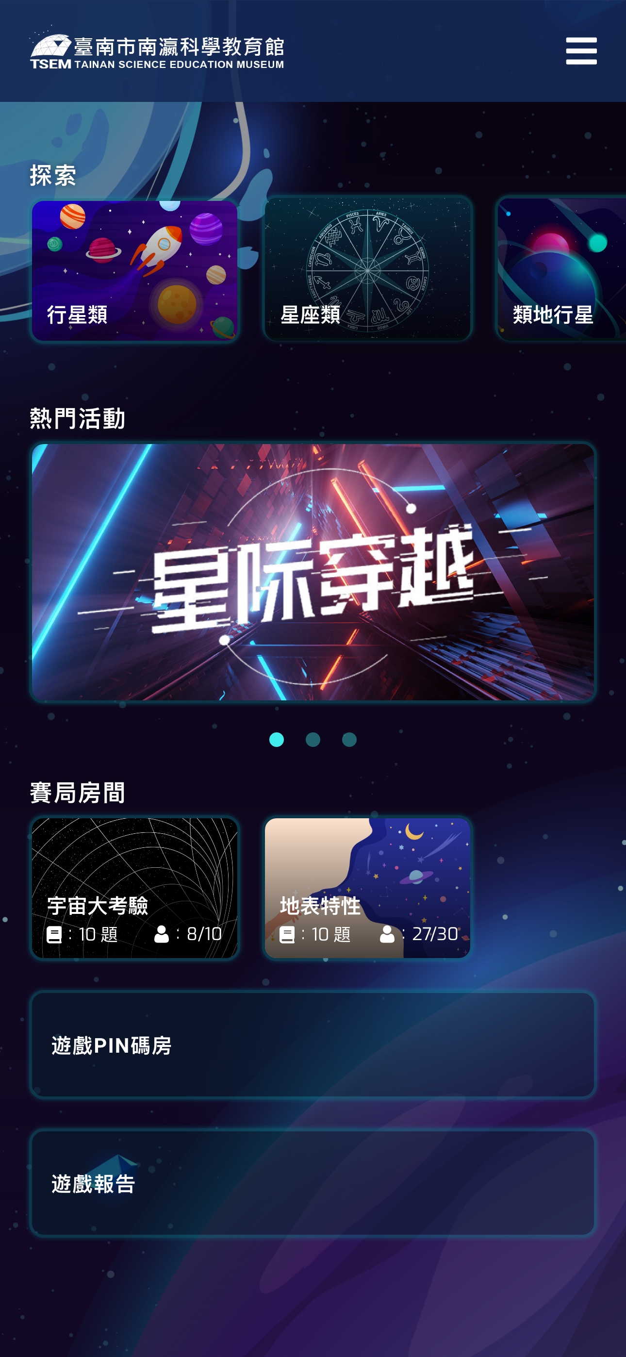
Immersion
Space-themed visuals create cohesive museum experience
Organization
Astronomy categories structure question bank for easy navigation
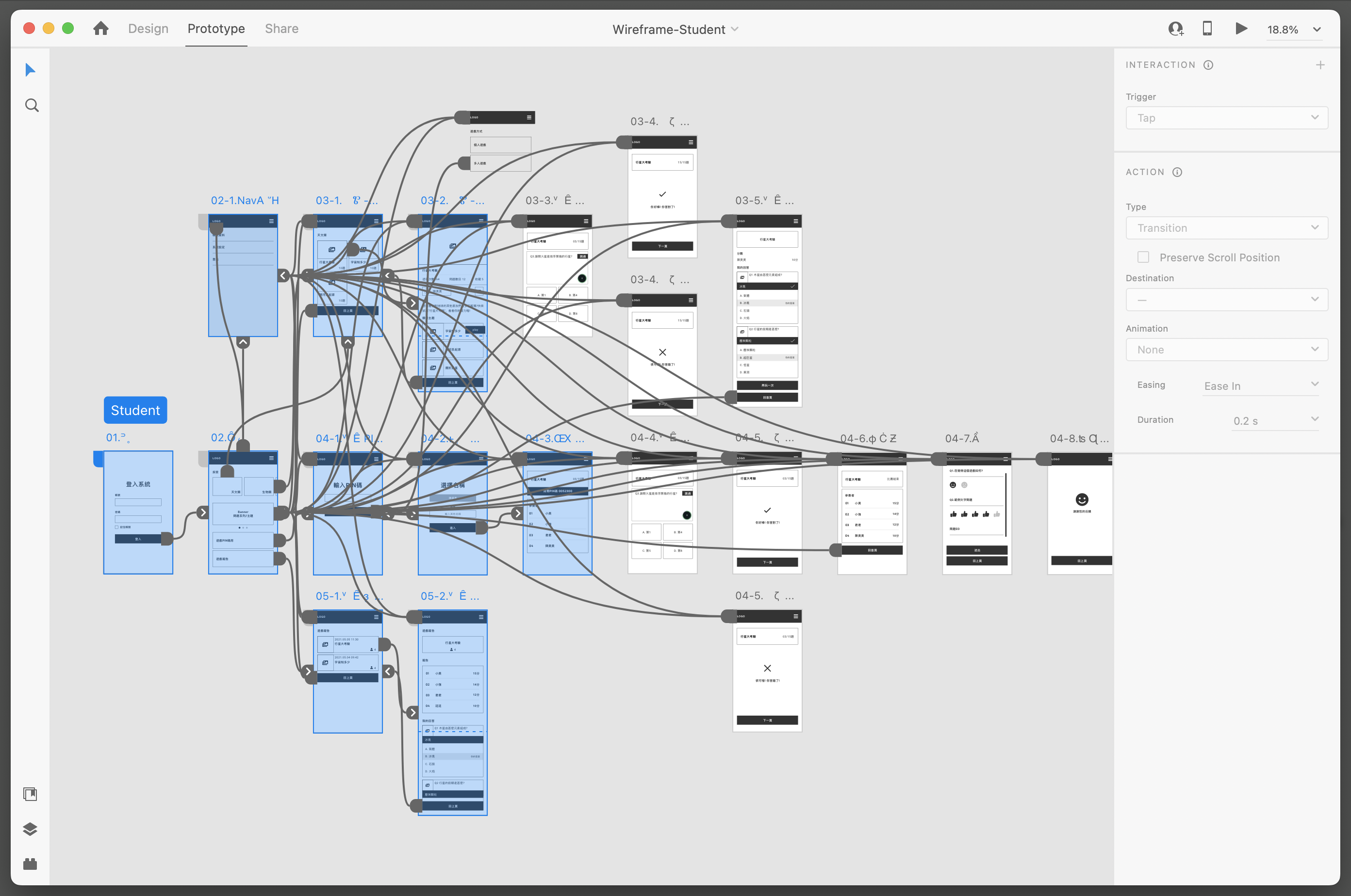
USER FLOW
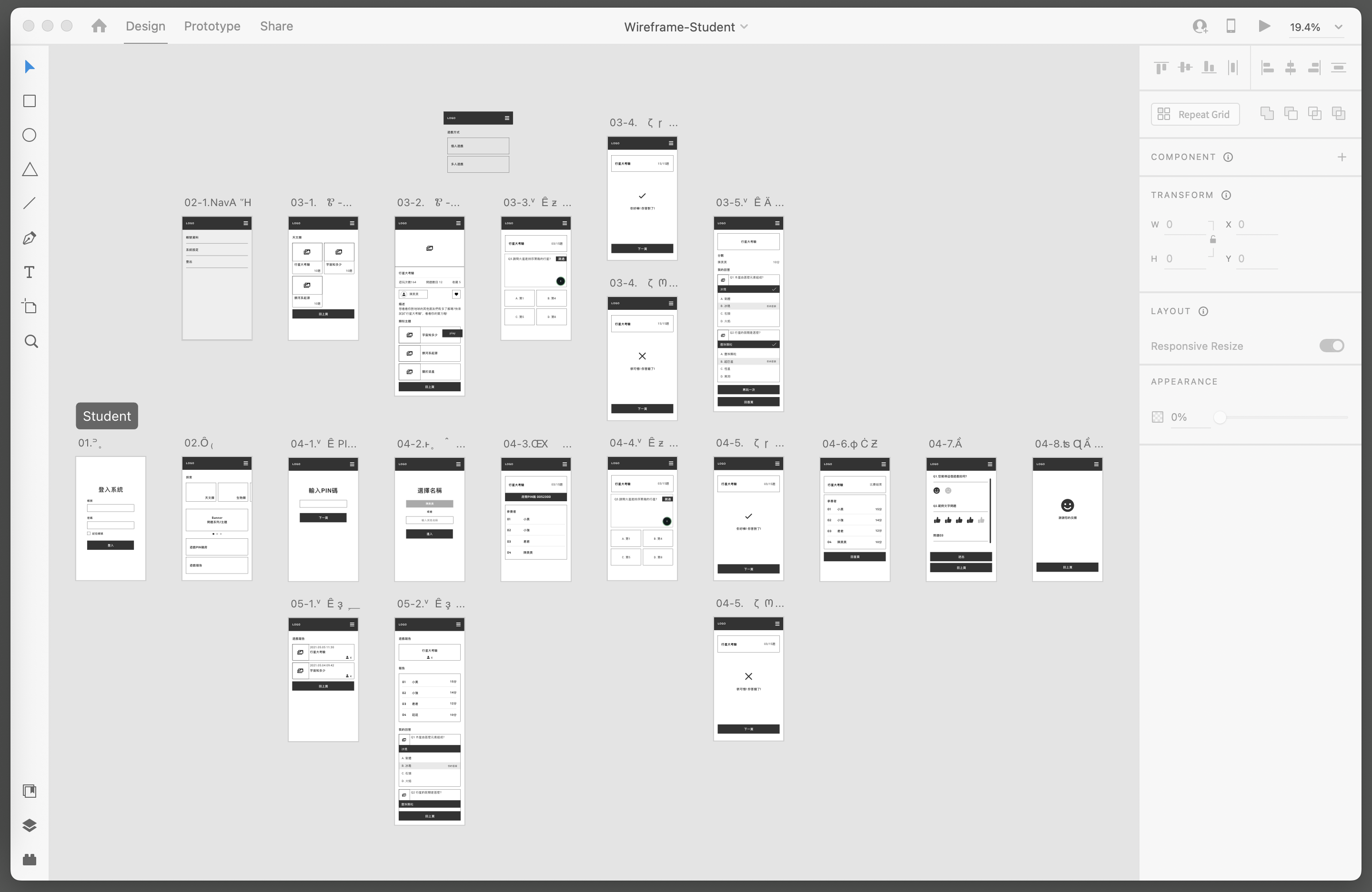
DESIGN EXPLORATION & ITERATIONS
I analyzed established educational quiz platforms like Kahoot! and Quizizz, observing how they engage students and support teacher workflows:
Option 1 - Playful Style
Bright primary colors paired with simplified geometric shapes and cartoonish illustrations. While this direction strongly appeals to younger children, it risks appearing too childish and disconnected from the museum’s scientific brand.
Option 2 - Playful Style
Option 3 - Astronomical Style
Deep blue-purple gradients with cosmic elements, starfields, and refined astronomical imagery. This direction creates stronger thematic coherence with the museum environment while maintaining visual interest for young users.
Why Astronomical Style?
- Contextual Fit: Reinforces the museum’s educational mission, creating seamless transition from physical exhibitions to digital experience
- Age Appropriateness: Sophisticated enough for upper elementary students while still engaging younger grades
- Emotional Resonance: Evokes wonder and curiosity about space, aligning with the museum’s goal to inspire scientific interest
- Brand Consistency: Aligns with the museum’s existing visual identity and exhibition design language
The final design balances visual stimulation with educational credibility—avoiding excessive cartoonishness while maintaining enough playfulness to keep students engaged.
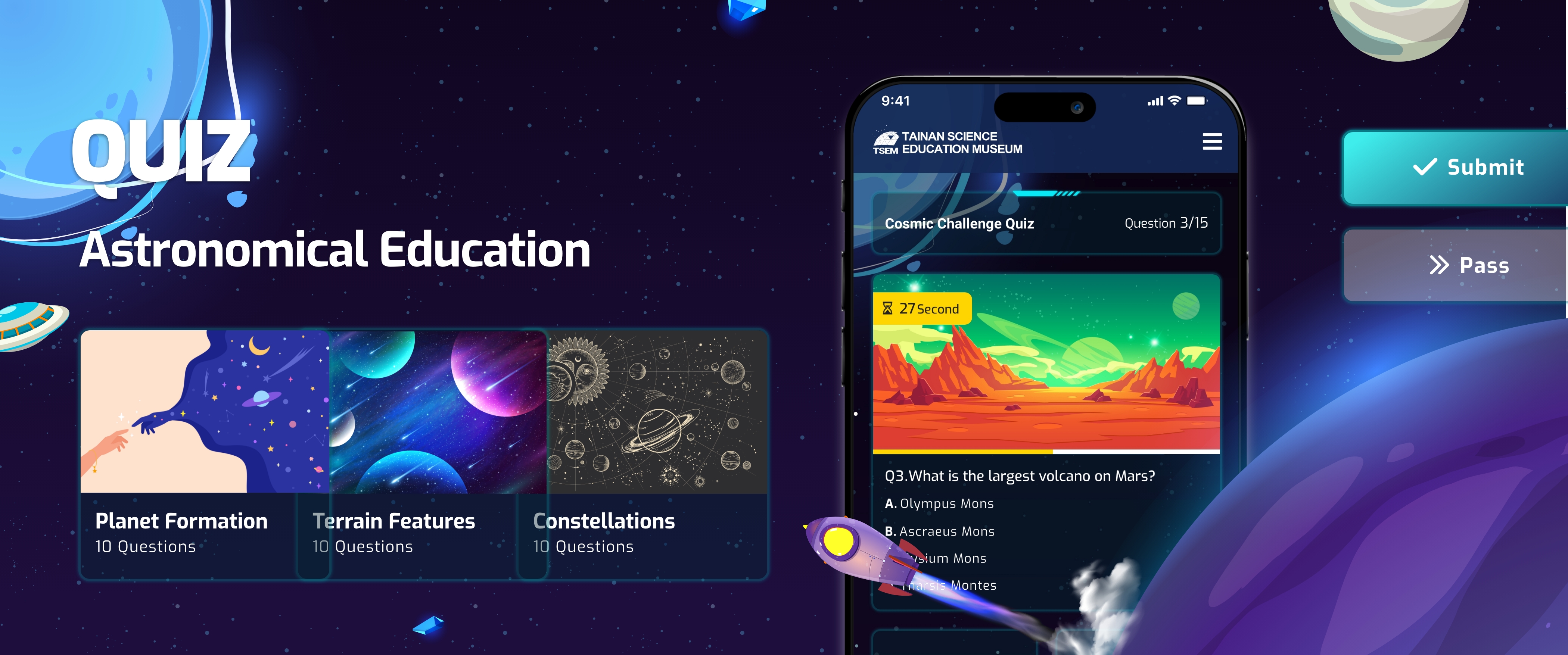
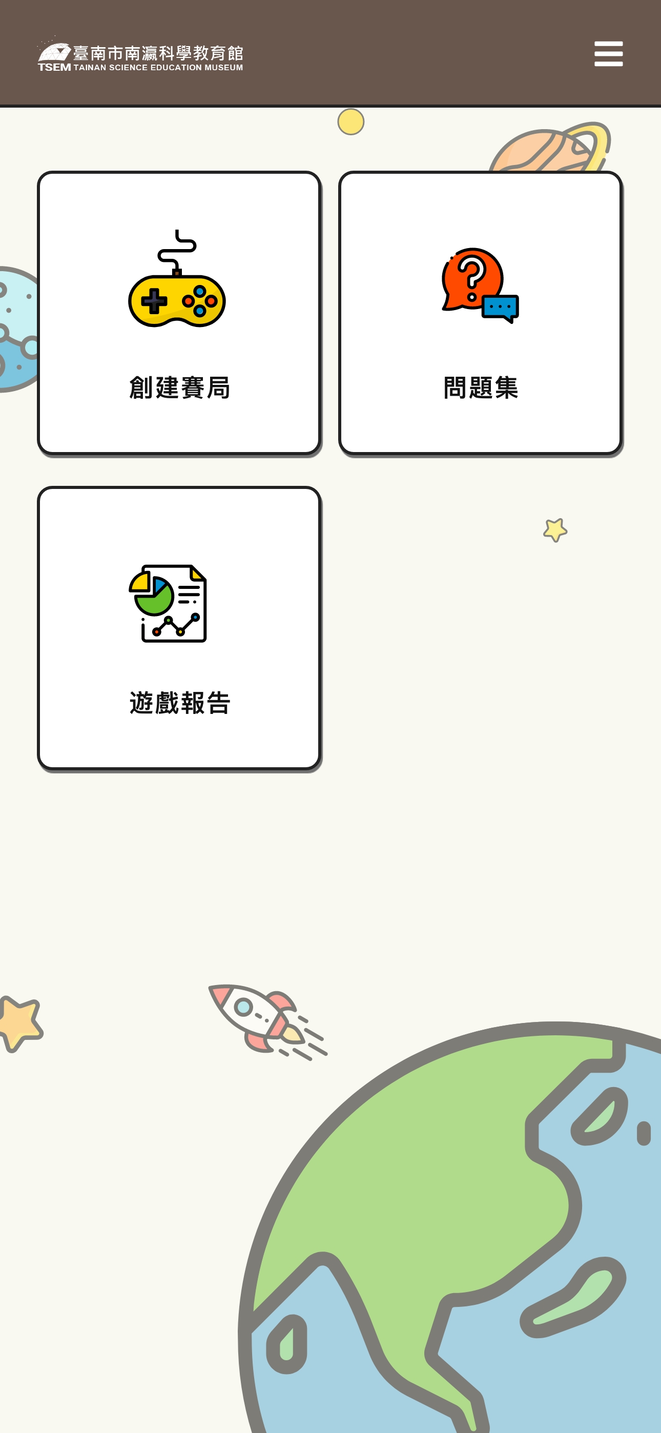
FINAL DESIGN
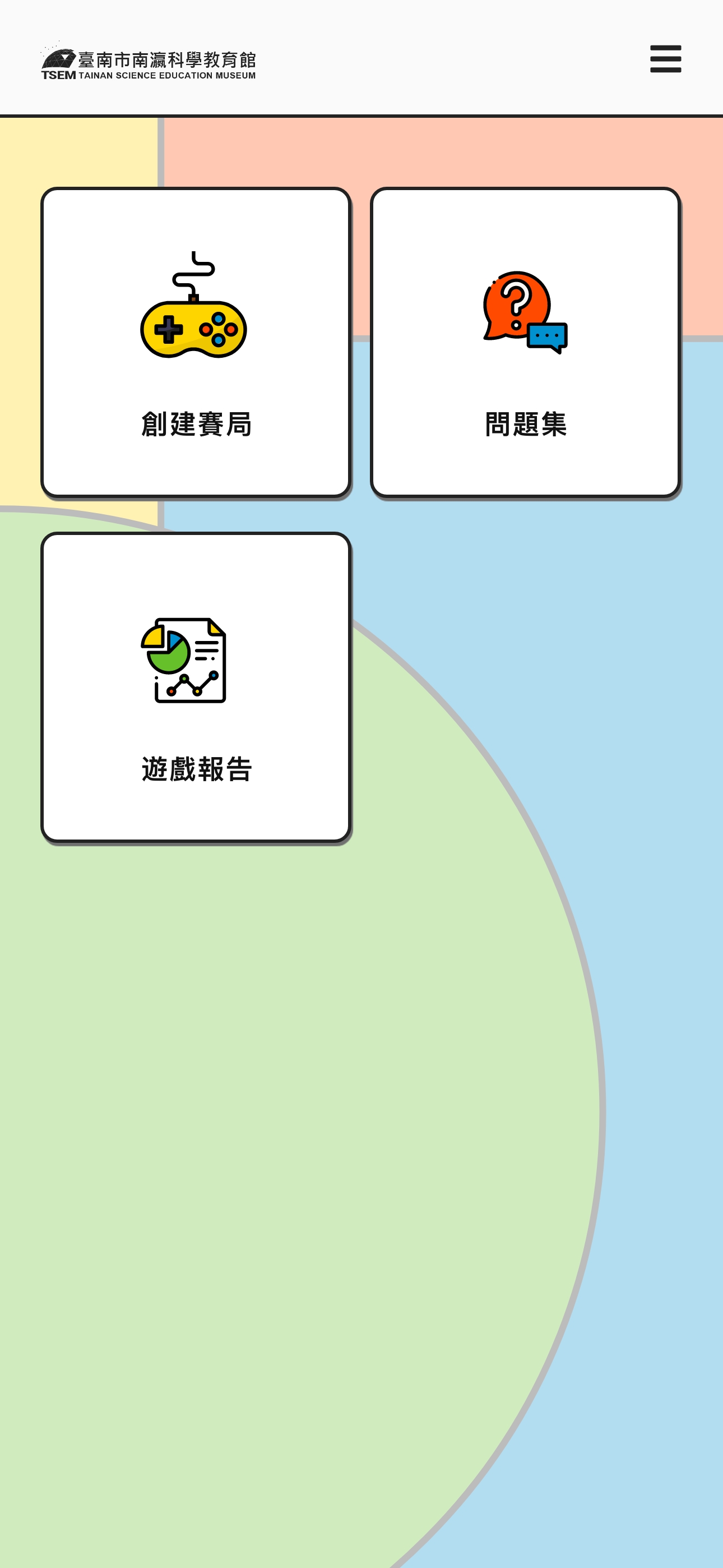
Teacher Platform: Designed for Efficiency and Control
The teacher interface prioritizes quick session creation and real-time monitoring.
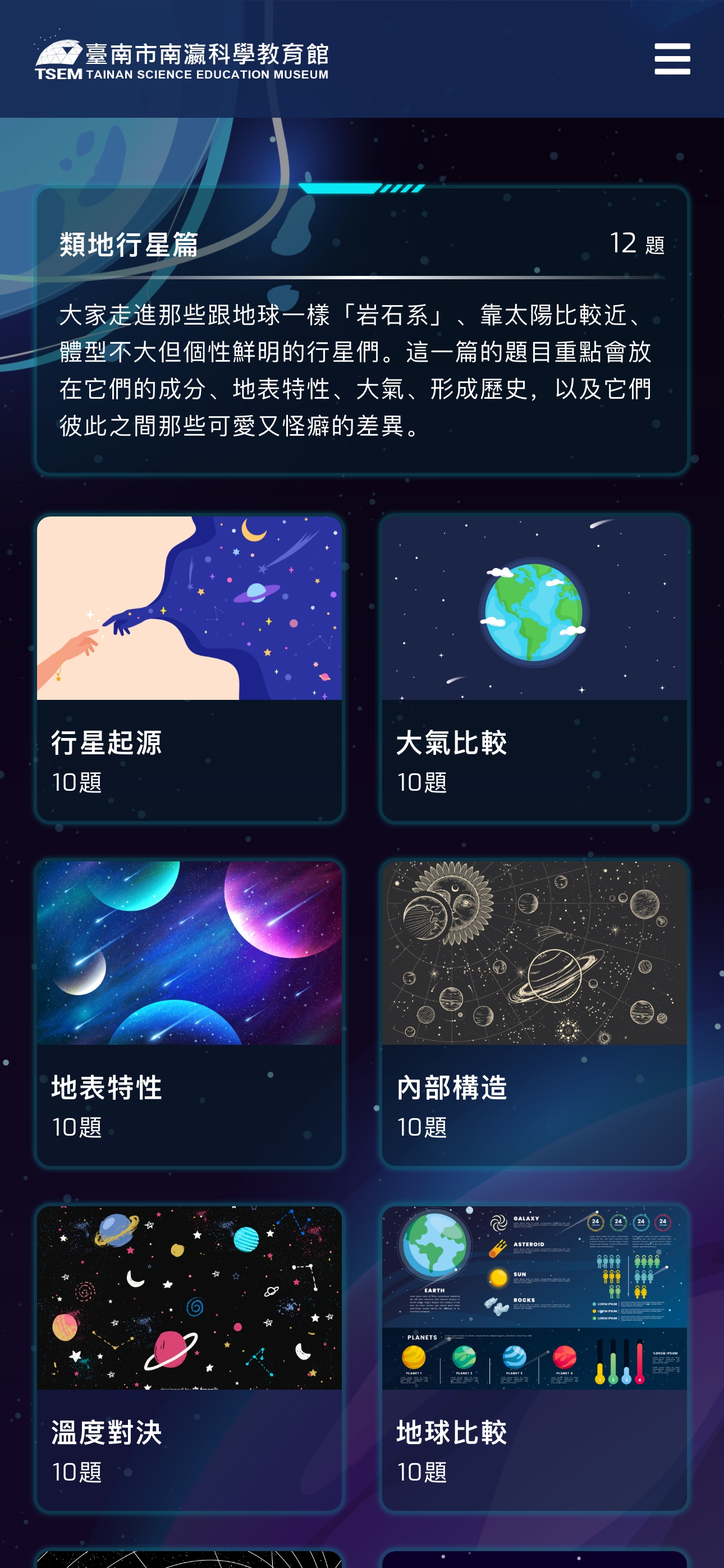
Browse and select questions from a categorized astronomy question bank, such as Terrestrial Planets, Gas Giants, Moons & Satellites
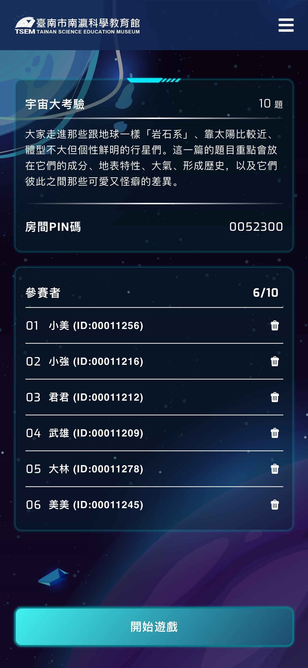
Create custom room codes for student entry
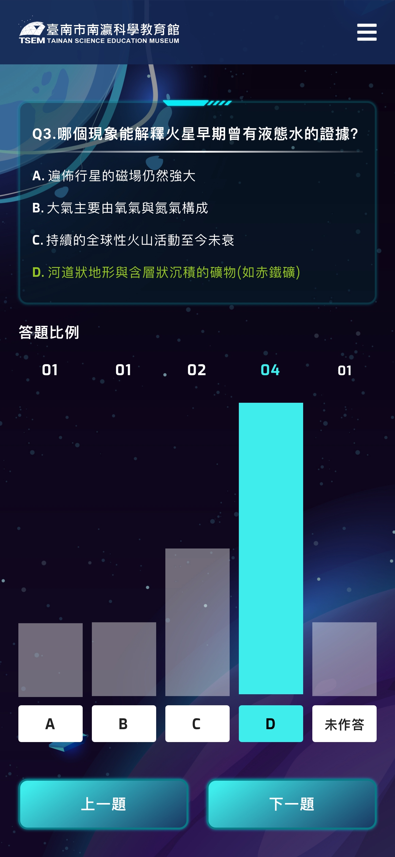
Monitor real-time participation and progress
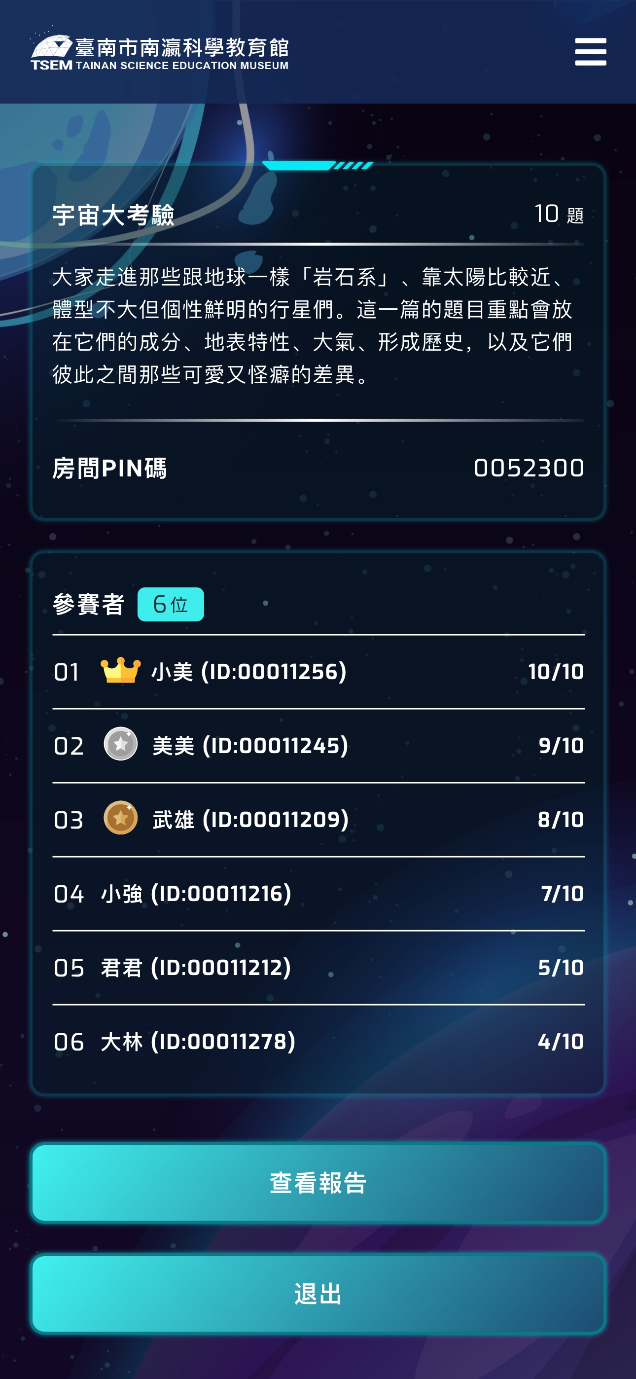
View aggregated results after quiz completion
Design Rationale: Teachers typically manage large groups in time-constrained environments. The interface minimizes steps to launch a session—often just 5 clicks from login to live quiz—while providing clear visual feedback on student engagement.
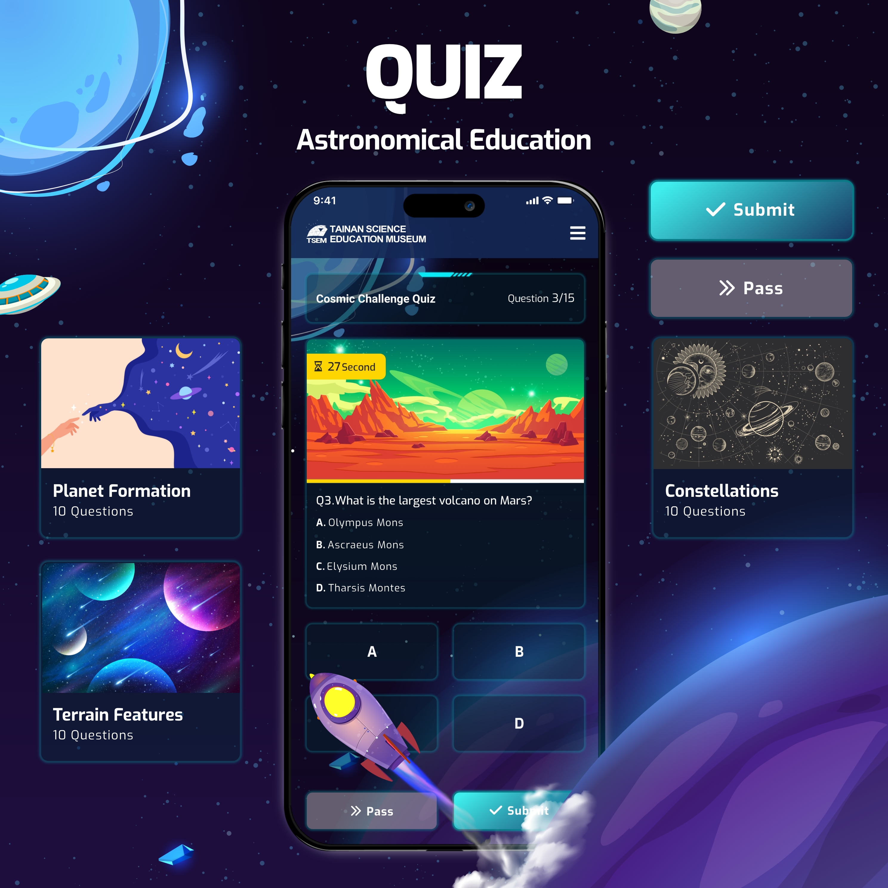
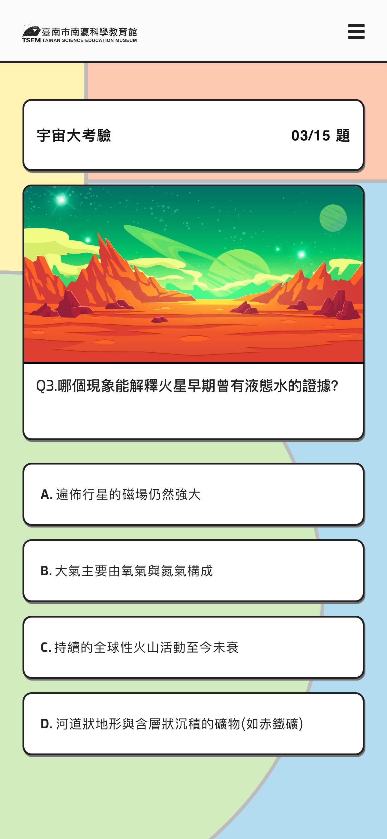
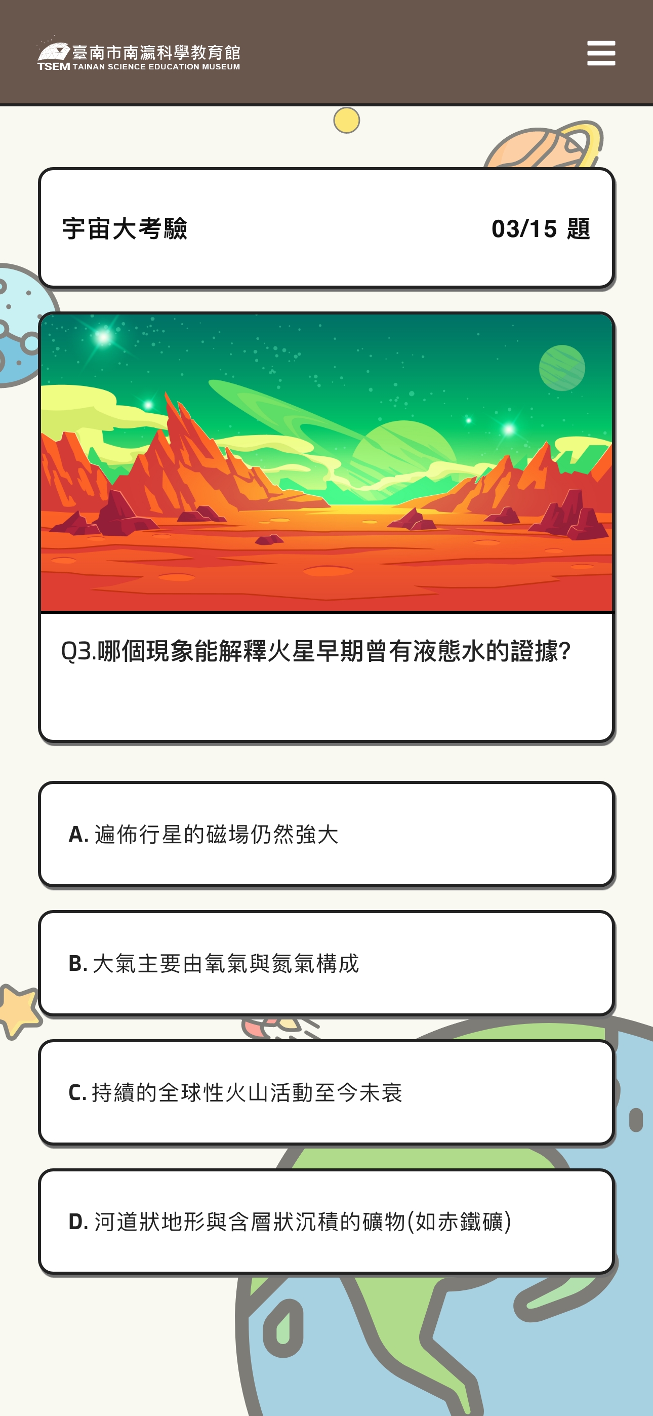
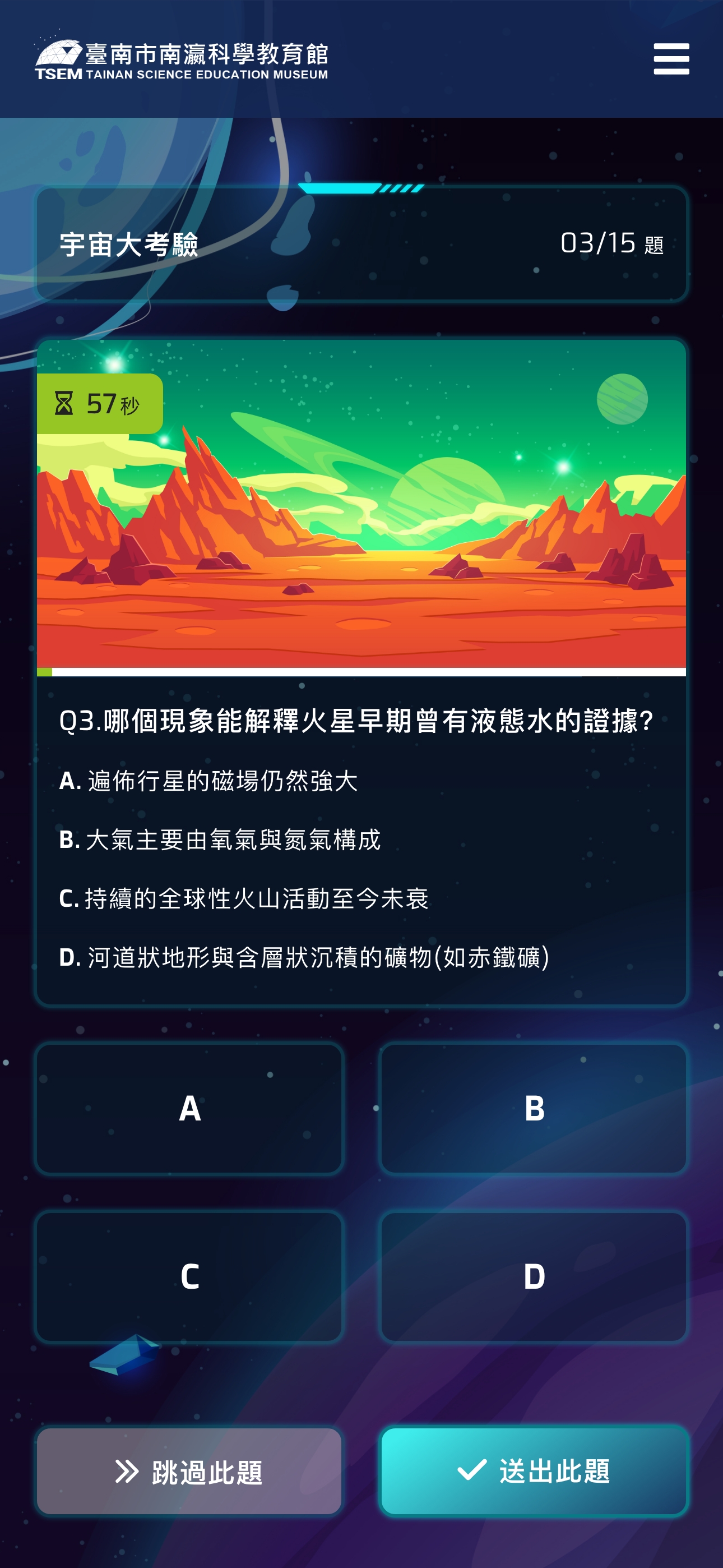
Student Platform: Focused on Engagement and Clarity
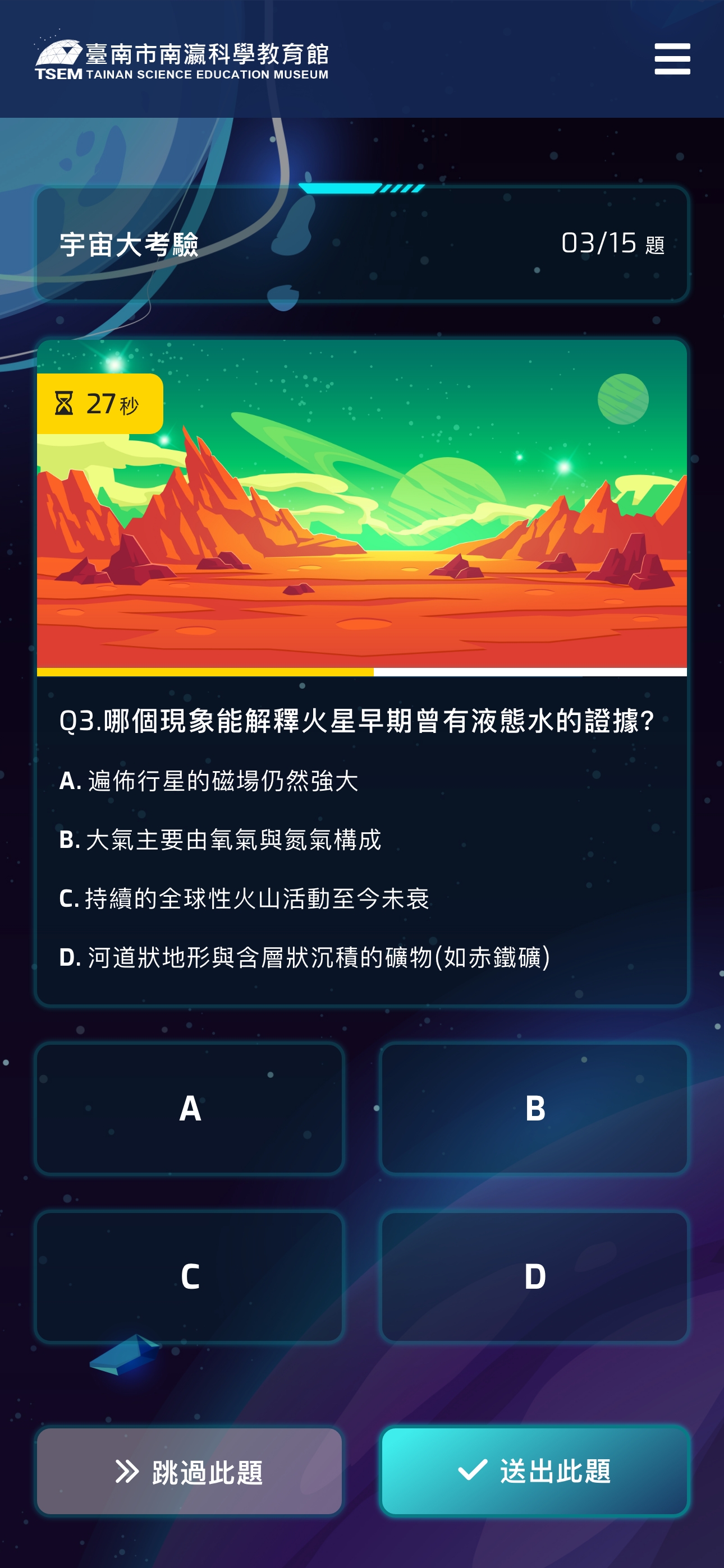
Easy-to-tap answer options for quick responses
Clear progress indicators showing question count and completion status
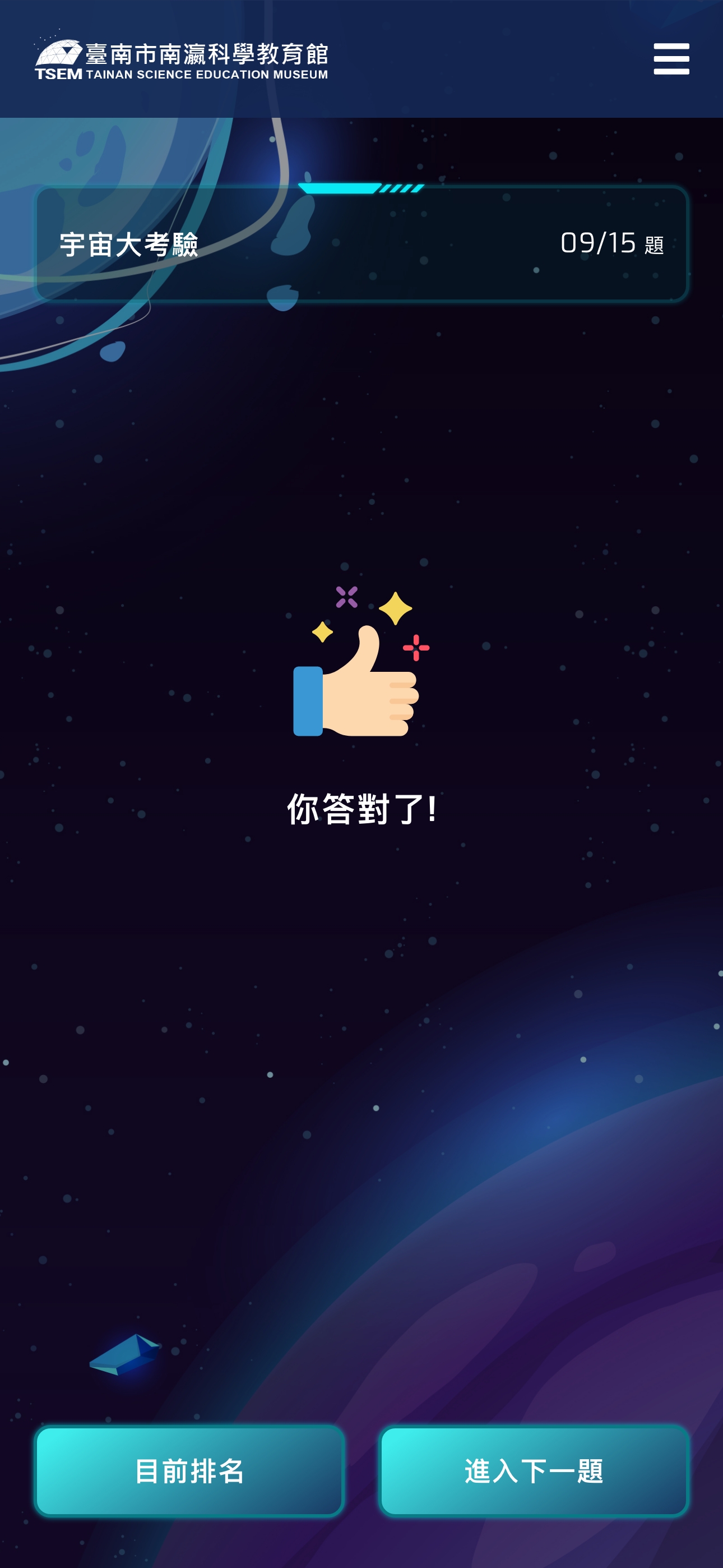
Instant visual feedback on correct/incorrect answers
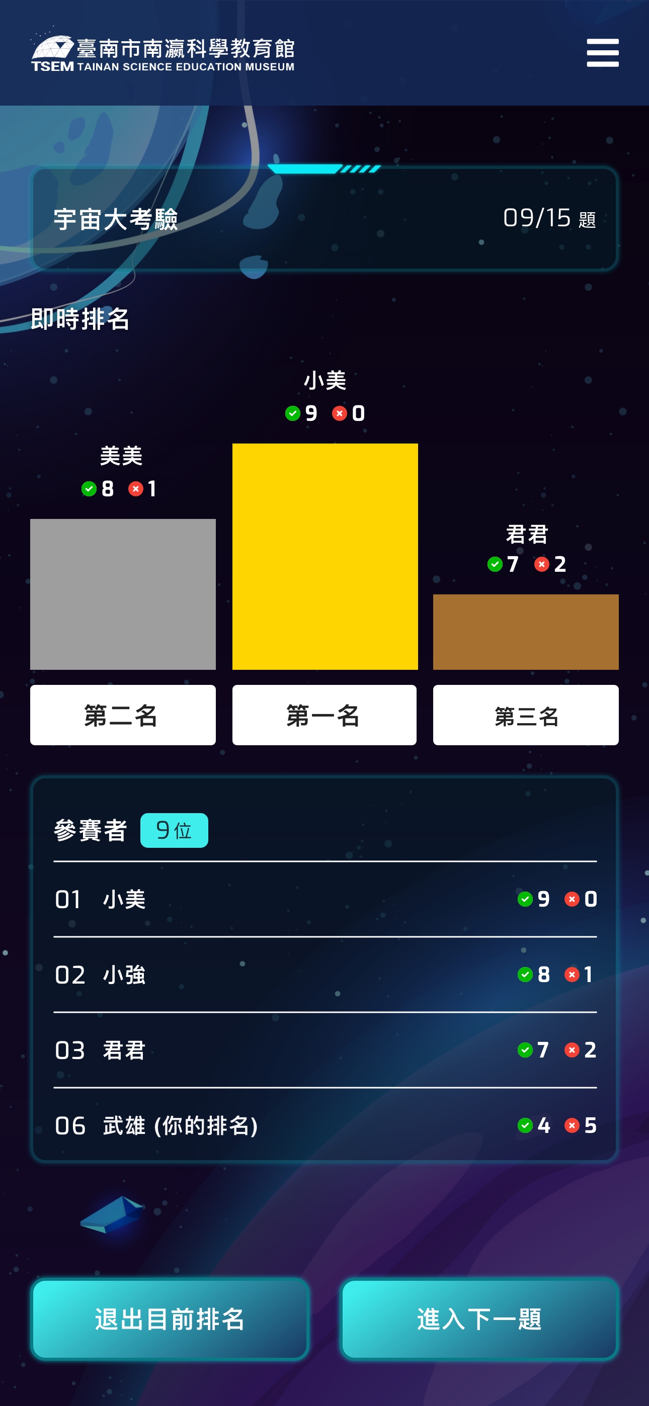
Real-time leaderboard displaying top performers to motivate participation
Why Show Only Top 3?
- Motivational Effect: The “honor” of top 3 placement drives competitive motivation and engagement
- Avoid Excessive Comparison: Hiding full rankings reduces frustration for lower-performing students, shifting focus from “where I rank” to “how many I answered correctly”
- Educational Context: Teachers can guide students to focus on personal performance and improvement rather than overemphasizing winning/losing
Design Rationale: Elementary students need clear visual hierarchy and instant gratification. The interface uses high-contrast elements and minimal text to reduce cognitive load, allowing students to focus on content.
DESIGN CHALLENGES & SOLUTIONS
Challenges 1
Maintaining Focus Across 10-15 Questions
Young students have limited attention spans, with lengthy quizzes risking disengagement.
Implemented clear progress indicators (e.g., “Question 5 of 10”) and varied question formats to prevent monotony. The final bar chart ranking reveal serves as an anticipated “reward,” motivating completion.
Challenges 2
Simplifying Teacher Onboarding
Teachers have varying technical proficiency and limited training time.
Designed a streamlined 3-step process (Select Topics → Create Room → Share Code) using intuitive icons and minimal text. Pre-categorized question banks eliminate manual question entry, reducing setup time to under 2 minutes.
Challenges 3
Adapting to Diverse Device Capabilities
School groups bring various devices—older smartphones, different screen sizes, unstable WiFi
connections.
Designed responsive layouts adapting to different screen sizes, optimizing asset loading to minimize bandwidth requirements. Used simple CSS animations instead of heavy graphics, ensuring smooth performance even on older devices.
Reflection
Designing for Dual User Groups: This project taught me the complexity of designing for dual user groups. Teachers need efficiency and control; students need engagement and instant feedback. How to make these two experiences operate independently yet work seamlessly together became a constant consideration throughout the design process. The biggest challenge was finding balance: giving teachers sufficient administrative control without overwhelming the interface, and providing students with engaging experiences without losing them in the process.
Visual Design’s Role in Educational Products:I gained deep appreciation for visual design’s role in educational products. For elementary students, the interface isn’t merely a functional vessel—it’s a key motivator. Choosing the astronomical theme over a playful style taught me the delicate balance between “attracting children” and “maintaining educational credibility.” This wasn’t just an aesthetic decision—it was strategic. We needed design that makes students “want to participate,” not just “looks cute.”
Systems Thinking in Real-Time Interactions: This was my first experience designing a real-time interactive system—teachers create rooms, students join, answer synchronously, see live rankings. This multi-user collaborative flow taught me to think in “systems” rather than “screens.” I realized that good UX design isn’t just about smoothing a single user’s journey—it’s about considering how multiple roles interact within the same system and influence each other.
Designing for Real-World Contexts: This project deepened my understanding of contextual design. The planetarium’s use scenarios: noisy exhibition halls, potentially unstable WiFi, teachers managing 30 students simultaneously, students using various devices. These real-world constraints shaped my design decisions—why the interface needed to be minimal, why buttons needed to be large, why the flow needed to be just 3 steps. This taught me to step back from “ideal conditions” and design for “actual conditions.”